Do you know this? A team building goes well. Everyone feels “somehow closer.” There are a few aha moments. And two weeks later, most of it is gone again – because no one can say exactly what actually changed, when it shifted, or why it suddenly worked.
This is exactly where the leverage lies: Teams develop not only in conversations but over the course of situations. Whoever makes this course visible gains a foundation that is much stronger than gut feeling – without it becoming dry or “obsessed with measurement.”
Why team development often fizzles out (even though the event was good)
In almost every workshop, there are dynamics that everyone perceives – but everyone remembers them differently. After the event, phrases like “The mood was strange” or “It got better from there” remain. That’s not wrong, just hard to use.
- No shared reference: Everyone has their own version of the course.
- No comparability: At the next workshop, you start again from scratch.
- Feedback quickly becomes personal: Because there is no neutral observation basis.
Key point: Team building works not only through the exercise – but especially through what you make of it afterward.
Which team dynamics really matter in practice
You don’t have to make team processes complicated. A few recurring observation areas that are relevant in almost every team are enough:
1) Communication flow
Who speaks, who listens – and how does that change? Is there genuine follow-up communication or mostly monologues?
2) Leadership change
Does leadership remain stable or change situationally? Does someone take responsibility when things get uncertain – or does the team withdraw?
3) Decision-making
How are decisions made: by consensus, by pressure, by avoidance, or by clarity?
4) Adaptability
How does the group react to new rules, disruptions, or unexpected tasks? Does it remain flexible or does it turn resistant?
5) Emotionality
Energy, tension, frustration, motivation – often the strongest drivers of collaboration and at the same time the worst named.
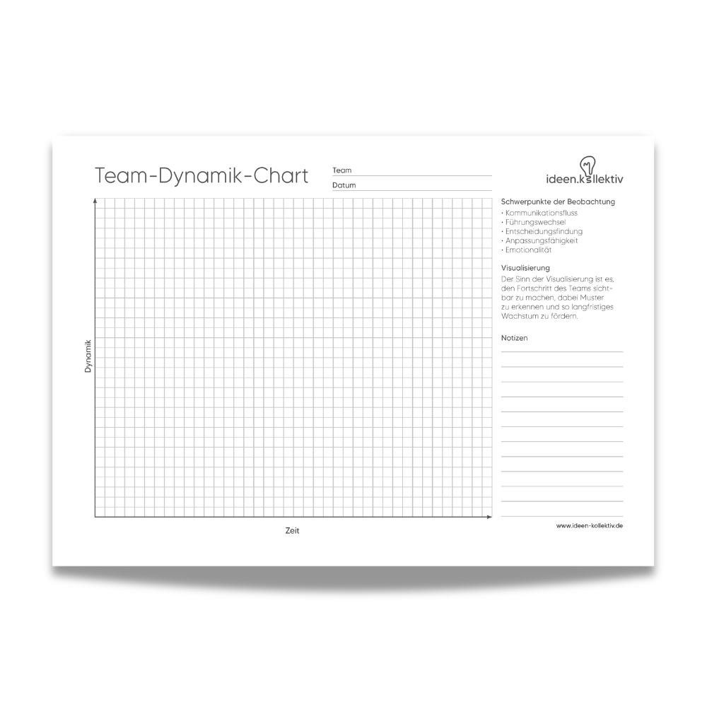
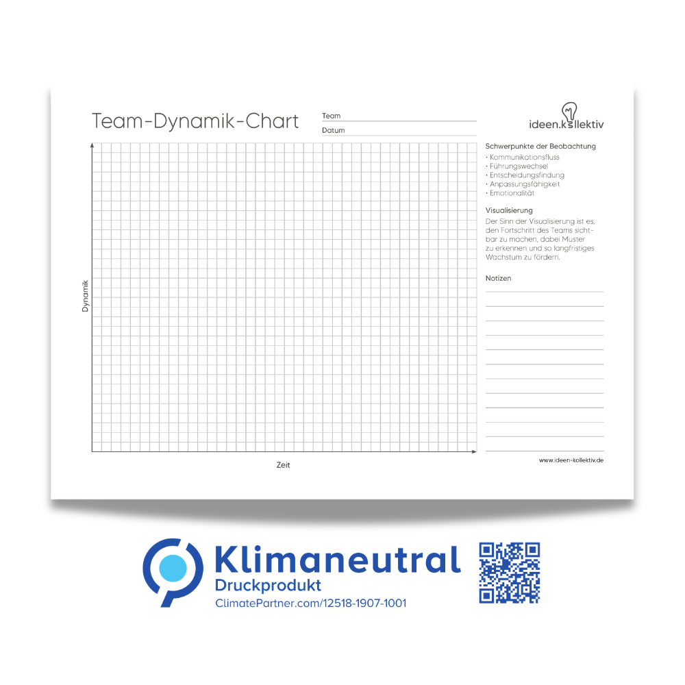
By the way, these focal points are exactly the five classics you also find as observation fields on a team dynamics chart (communication flow, leadership change, decision-making, adaptability, emotionality).
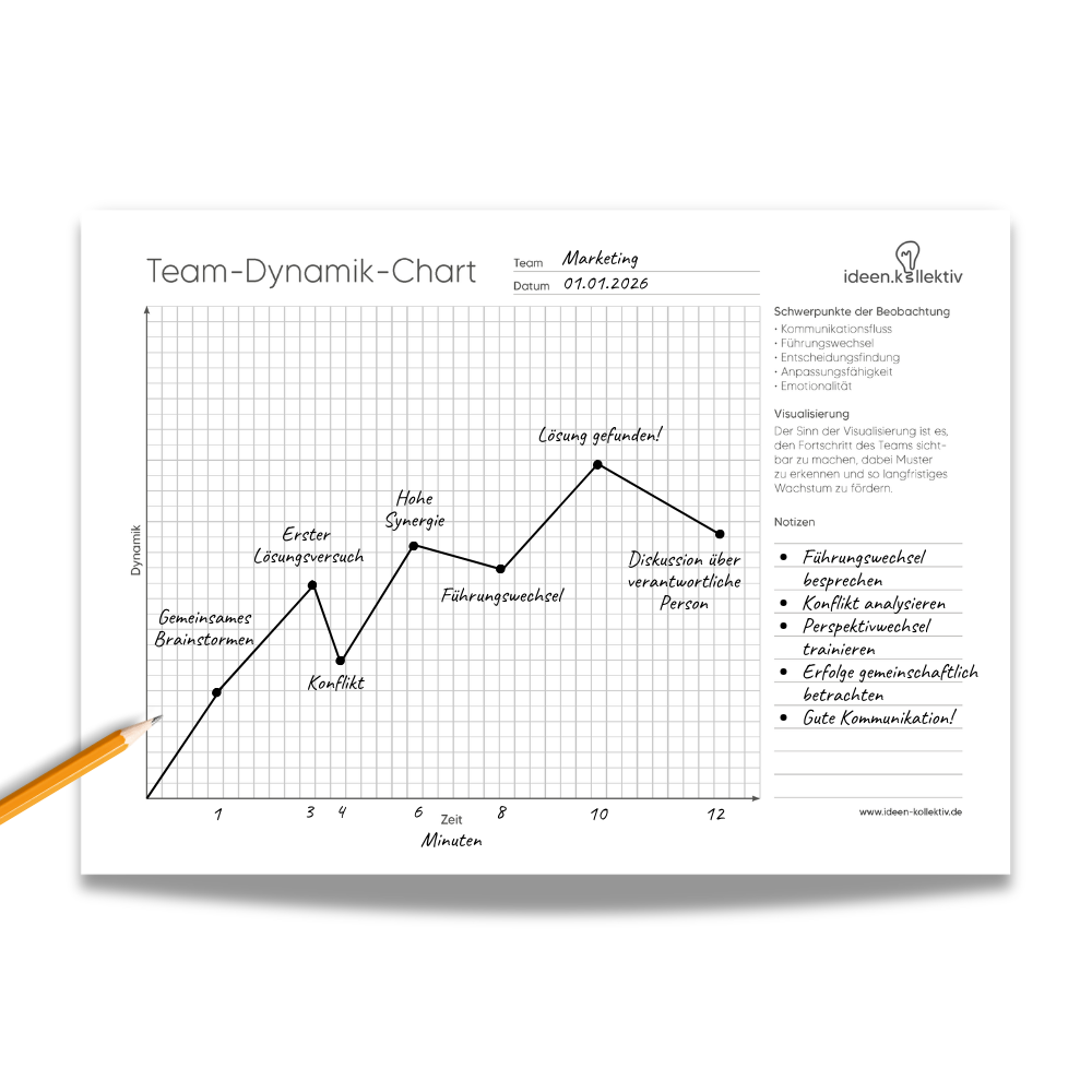
This is how you make team dynamics visible: Time + Intensity
The trick is simple: You give the development a shape. A horizontal axis for time, a vertical axis for intensity/dynamics. This makes it visible when something happens and whether it was just a short peak or a real trend.
Option A: One dynamic – very simplified (like a stock chart)
Want to keep it pragmatic? Pick one focus (e.g., communication flow) and draw it with a pen over time. Done. That’s often enough to become much clearer in the analysis.
Option B: Multiple dynamics in parallel – as layers (with colors)
If you want to go deeper, you can map several developments simultaneously – ideally in different colors. This creates layers that you can overlay and compare:
- Blue: Communication flow
- Green: Leadership change
- Black: Decision-making
- Orange: Adaptability
- Red: Emotionality
Important: You don’t have to do it this way all the time. But it’s extremely helpful if you want to show, for example: “The communication was actually good – but the emotionality clearly shifted from minute 25.”
Pro tip: If you use multiple layers, keep the lines rather rough and use the notes for context. Otherwise, it quickly feels “too technical.”
Notes: The small field that makes the biggest difference
Lines show patterns – notes explain them. A few bullet points are enough:
- “New rule introduced”
- “Conflict between A and B becomes visible”
- “Joke/relief, mood improves”
- “Decision postponed”
Practical example: Documenting teambuilding (without it feeling awkward)
Imagine you do a cooperative team exercise where pressure arises (time limit, limited resources, unclear roles). You observe three things: communication flow, leadership changes, emotionality.
| Phase | What you observe | What you note down |
|---|---|---|
| Start (0–10) | High energy, many speak at once | “Goal unclear, roles missing” |
| Middle (10–25) | Leadership changes, communication becomes more structured | “A takes over moderation” |
| Peak (25–35) | Emotionality rises, communication briefly breaks off | “Time pressure, blaming” |
| End (35–45) | Tension decreases, solutions become possible again | “Restart after a short break” |
In the evaluation, you point not at people but at the course. That makes feedback noticeably fairer – because it’s about patterns, not blame.
Evaluation questions that really open something up (instead of "How did you find it?")
- When did the mood change – and how did you notice it?
- What helped communication to work again?
- What kind of leadership supported the situation – and why?
- How did you handle uncertainty / time pressure?
- What would you consciously do earlier next time?
Mini rule: First look at the course, then interpret. Not the other way around.
Who especially benefits from this type of documentation
- Coaches & Moderators: because you make patterns visible and stay neutral.
- Leaders: because you can reflect on team processes in a comprehensible way – without drama.
- Organizations & Administrations: because workshops often end up "nice but without effect."
- Schools & Education: because class dynamics suddenly become discussable in group work.
Team dynamics are there – the question is whether you use them
Teams develop anyway. But development only becomes reliable when you can see, name, and make it comparable. A simple visualization over time is often enough to turn a "good workshop" into a real learning loop.